CASE STUDY
Omnitracs is a provider of fleet management software and hardware applications. Their business model was acquisition based, where they would buy smaller competitors who offered products that either aligned with ours, or filled customer needs we hadn’t yet met, where they would then rebrand them under their portfolio of applications. However, after years of this, there were huge gaps where no two products looked or worked anything alike, and the user experience was frustrating at best.
Our goal was on the surface simple. We had to take all of our existing applications & migrate them into a single platform where users had a one stop platform. Think Microsoft’s business suite, or Adobe’s creative suite. This required us to find redundancies in our current offerings and solve for migrating them from duplicates into a single app, a complete rebrand, design, testing and building both a new portal and a complete design system.
01
Starting off, we had to define just what our hub was. It had to offer our clients solutions they were familiar with - in a single space - ranging from navigation and route management to compliance, logging and payroll.
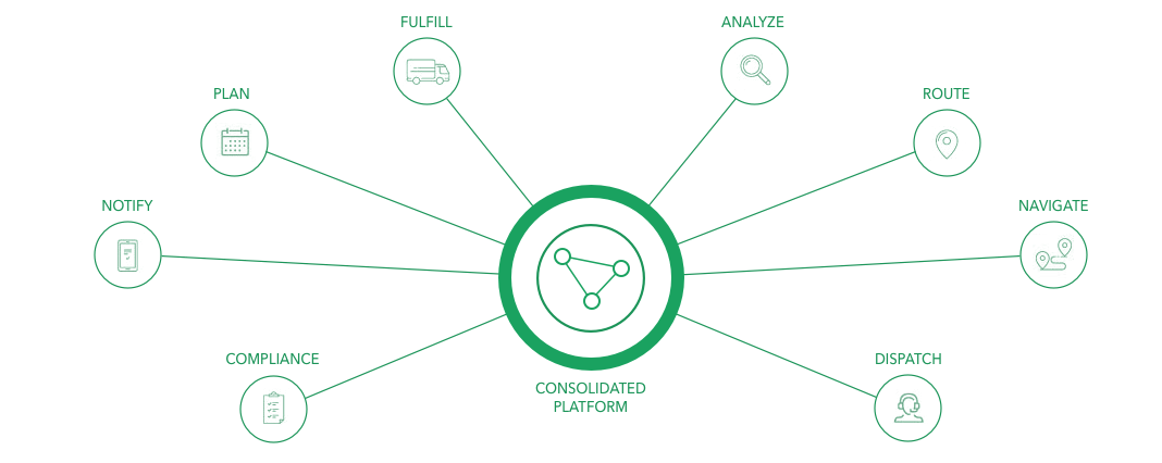
Our goal was to create one consolidated platform that provided complete feature coverage of our diverse line of products
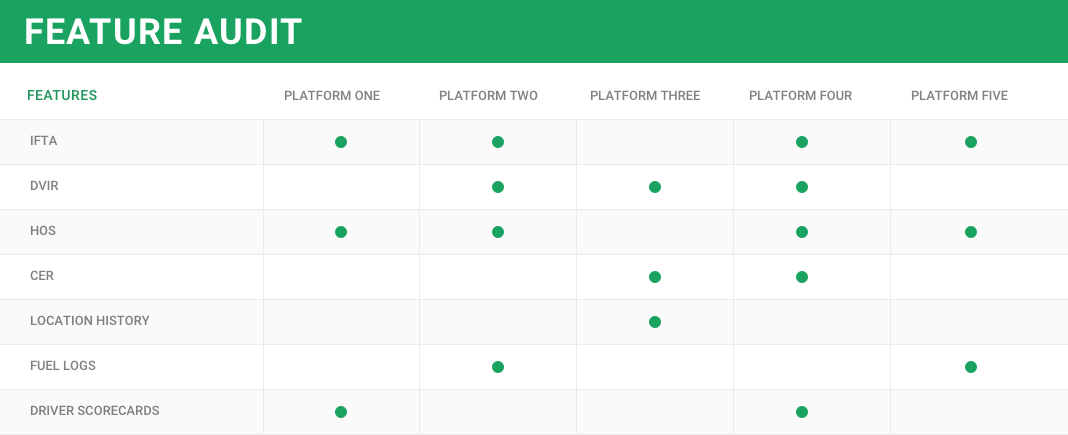
The team went quickly into a feature audit to see which applications we had that had redundant features, where we could combine 5 platforms into one.
02
Wireframes were mocked up when we had an idea of what ‘buckets’ our features would live in, what those features were ( and their subsequent requirements ), and how our users interacted with our current offerings, specifically our navigation and app launcher. This was iterated and reiterated through the coming months, as our initial flows and wires showed us where the gaps in our knowledge lie. Through each state, we ran usability tests with low task requirements to make sure our designs were usable and easily understood by our legacy users.
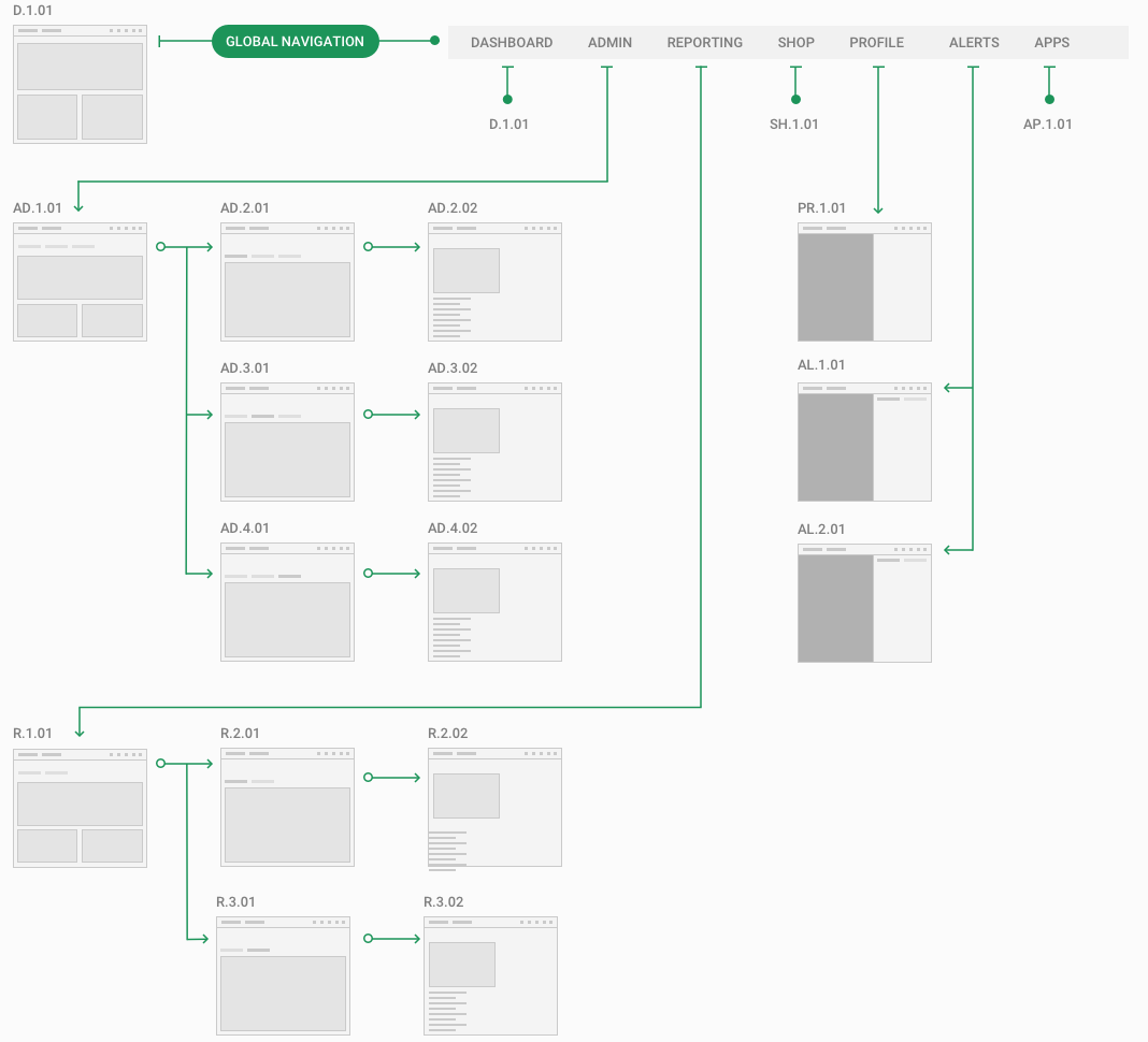
While pieces of the overall sitemap changed and a few layout formats were added, we were able to build a solid navigation, app launcher, and dashboard that led to us having a solid idea of what pages and layouts would be needed for phase 1 of our roll out
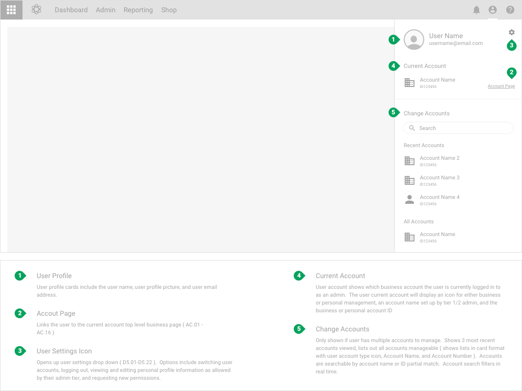
Outlining & documentation of key components that would live globally - main navigation, user settings, notifications, help, and our app launcher
Our team was making good headway, however we needed approval from product/program teams to keep going. They wanted to see more than just sketch files, whiteboards covered in markers, and post its. I was mildly familiar with Angular, and as it was the language used by others in engineering, I build a prototype in Angular 5/6.
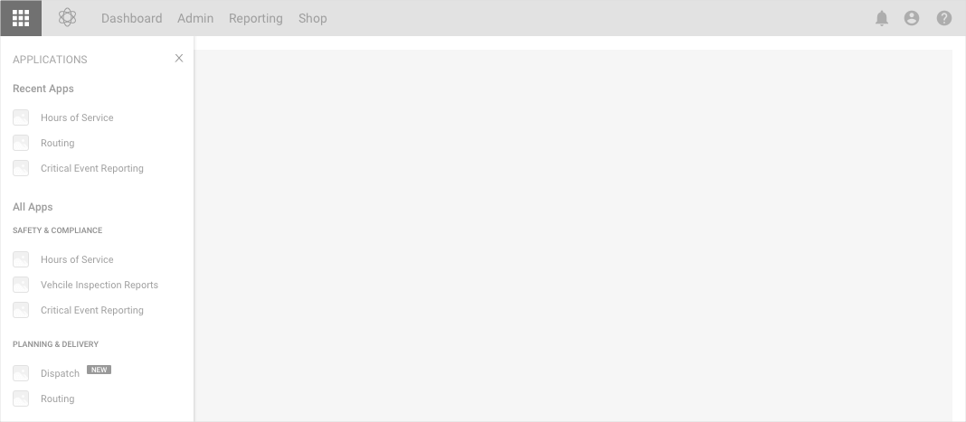
Demo page with our top level navigation & app menu active
While I was building the web app, we turned to the design system we wanted to implement. Going thru spec files, we noticed that each designer who had a hand in the project was using slightly different assets and styles. Colors, spacing, font size - everything needed to be unified, designed once and built once.
03
Customers used a variety of different applications we offered, but there were a few templates/types of pages that made up about 90% of our use. Maps/Routing, Data Grids, and Administration. For routing, we started again with one of the more simple use cases. Better to find pain points early before building the more complex pages.
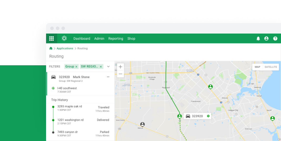
This led us to build our routing page - where admins could track drivers, deliveries, routes, and potential/realized violations.
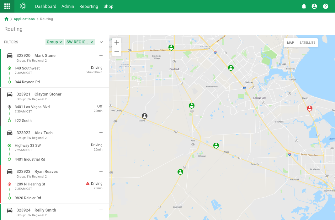
Filters give dispatch an easier to digest & more relevant view
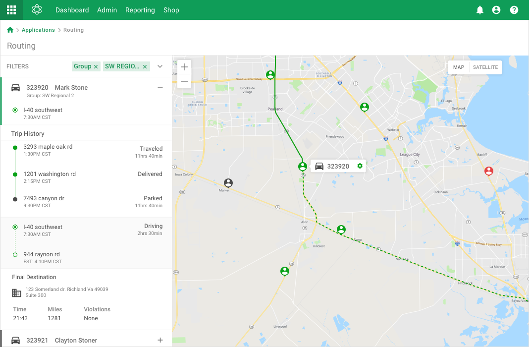
Admin and dispatch can drill down from filters to individual drivers to see driving history, routing, compliance requirements, and delivery details
04
Our data grids were about as complex as could be. They required, depending on use type, everything - pinned columns/rows, editable cells, ordering, filters - they basically spanned from a view only table to an excel-like grid. We designed for everything we already had in use, with room to grow with requirements.
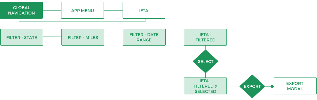
A quick user flow from global navigation to opening the relevant application, filtering as needed, & exporting
We started with a relatively simple grid, allowing a handful of filters, row selection, sorting columns by variable, and exporting to see how our users interacted with our new product.
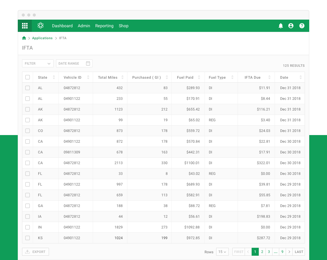
Overview of our applications data grid - before filtering
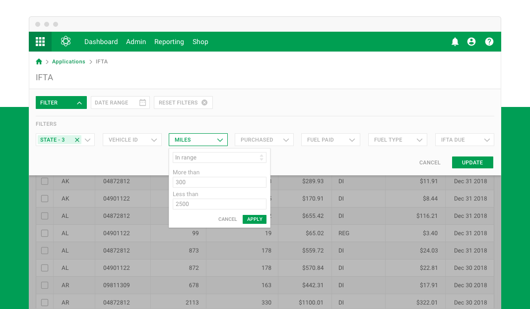
We allowed for some complicated filtering options, including variable range filtering & expression matching
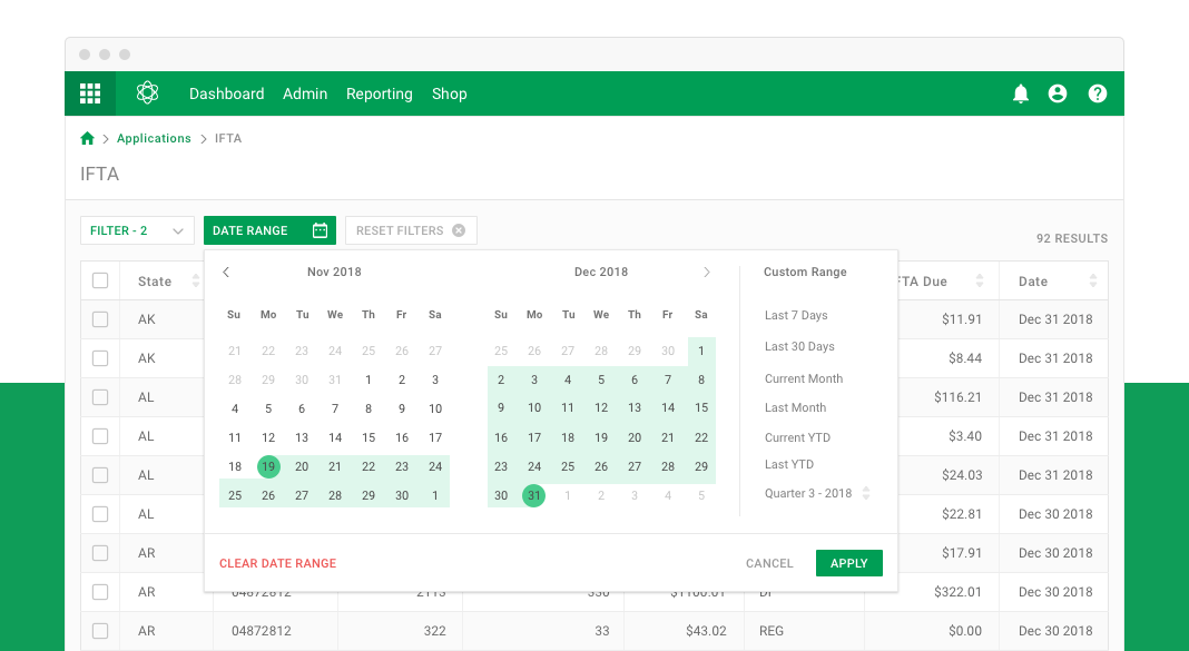
A big request from our users was to allow filtering by date range, with an emphasis on last 30 days & quarterly
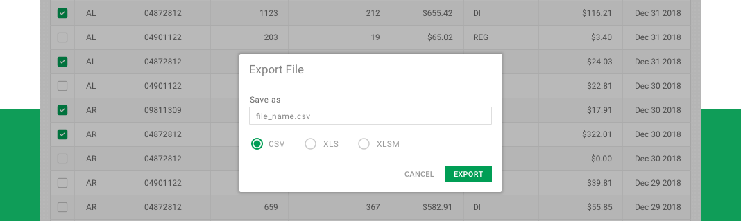
Our bigger customers used outside and in house software solutions for certan workflows, and needed to be able to export data in various forms, including xls, json, and csv
This was one of the more simple data grids/filtering cases we had. While we designed with the more complex grids in mind, our team decided to start testing with something less intimidating. With a less complicated prototype, we were able to find quick pain points, usability issues, or testing notes quickly - before we spent hours going down a potentially bad avenue.
On top of exporting, we had cases where users were also able to import various file types ( CSV, XLS, JSON ). We found that when different organizations with different data organization schemas tried uploading, things broke quickly. Our solution was to standardize a set of templates where their values matched with our expected fields, both of import & export, to minimize the chances of corrupted data sets.
THE END
This was a massive undertaking by a small but talented team, with a limited time frame. It was a joy to work with these guys, and while this project is still a long way from launch, I feel we built & tested this concept from whiteboard to web successfully.
The biggest take away was - working in silos is a recipe for disaster. We started off with some great concepts and a lot of hard work, only to realize other departments had gone different directions. It took a great Program Manager and inclusion across departments to really get this back on track and into a good place.
Additionally, this was a great oppurtunity to really get hands on and talk to our users. One of the bigger surprises from our user interviews & testing was - our end users didn't necessarily WANT all the features we had planned. They, to a large degree, liked what we currently offered. They just wanted our applications to work more efficiently together. This was a great lesson in listening to our customers before going deep into design.