CASE STUDY
Geoforce track and trace is a cloud based software solution that integrated rugged GPS tracking devices in global satellite and cellular networks to provide asset tracking and management. The current platform was in need of an overhaul to provide a better user experience along with integration of new tools and analytics
Our team had the opportunity and challenge to take this project on from a fresh slate. On top of building better experiences and more intuitive workflows, we also had the chance to build a new design system that would enable us to work closely with engineering, building a next gen scalable component library
01
Our primary platform needed to be merged with a secondary software solution we had acquired a few years back. Our current workflow had users jumping between applications that offered very different experiences to complete tasks
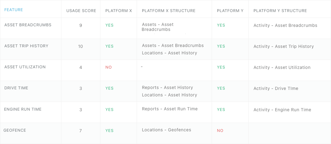
We started by making sure we had complete coverage by doing a feature audit on both platforms
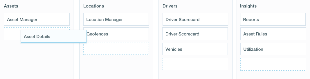
While we were here, we also had the opportunity to rework the site architecture into something users felt more comfortable with. We ran a number of exercises, including card sorting, to see where users felt features would be found
Once we had run a number of sessions, we logged our findings into a feature matrix and to help visualize what the ideal navigation hierarchy and parent/child feature relationship would look like
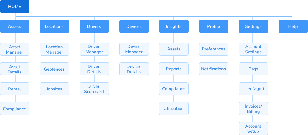
Our first iteration of the sitemap carried, utilizing our findings from user testing - this gave us a good base to start prototyping from
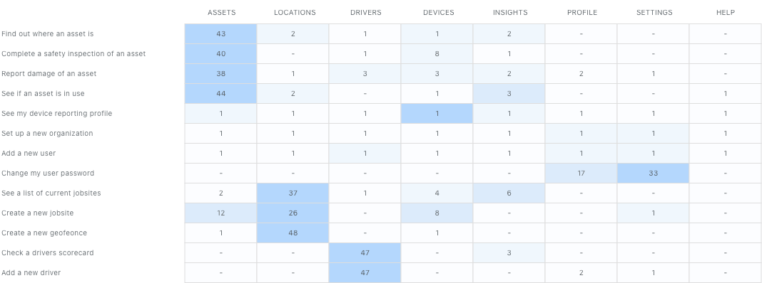
Before we started building pretty UI pieces, we wanted to make sure we were building the right thing. We built wireframes and conducting user testing sessions to gather feedback and iterate off our original designs. We used realistic customer data and a higher level of fidelity to make sure our users had relevant data to complete the tasks in our testing

On top of our mockup testing sessions, which were documented into dovetail, we also used analytic tools and session recordings to watch our user base interact with our application in real time. We got a better sense of what they were trying to do, and where we had an opportunity to improve
02
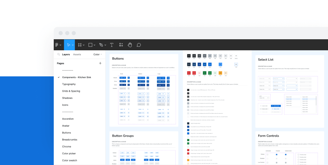
The engineering team had decided to build the next-gen app in React, and went with the robust Ant React UI library. We audited their current offering as well as our wireframes to get a comprehensive list of what components and guidelines we’d need to build and document
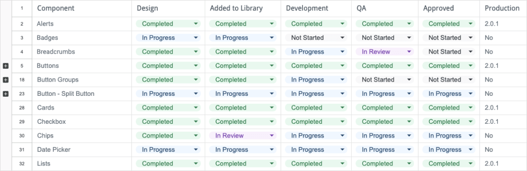
Our process was iterative from the start, working in 2 week sprints. We would design our components and do an internal review before signing off and adding them to our master design library. From there, hand-off to development was underway, where the designs would be brought to life, tested, and finally approved and added to our current beta build
We used a few different methodologies and borrowed heavily from the resources already out there. We primarily used a version of Atomic Design principles, focused on defining our atoms/sub-atoms first. Building blocks like type, color, and spacing built our foundation
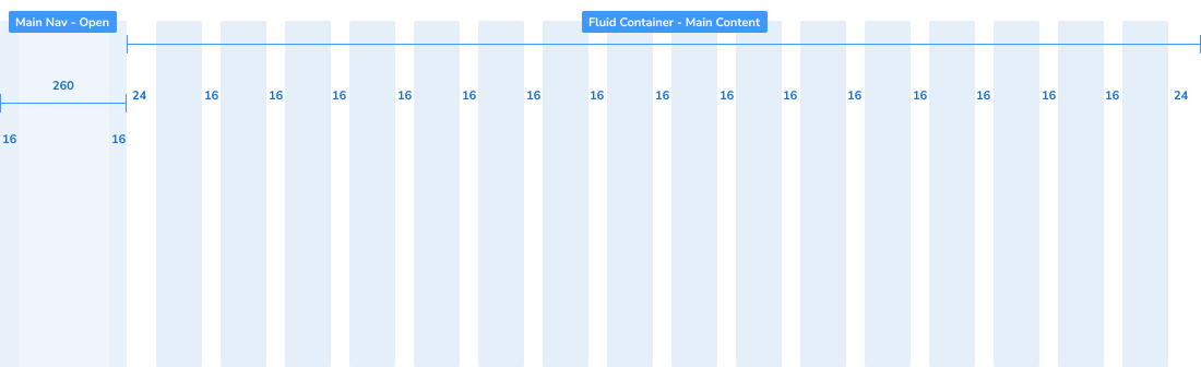
We settled on a base-8 grid to keep the team consistent and ease development handoff, and defined the shell of our application using Ant’s 16 column grid for the body and a left hand navigation for ease of use
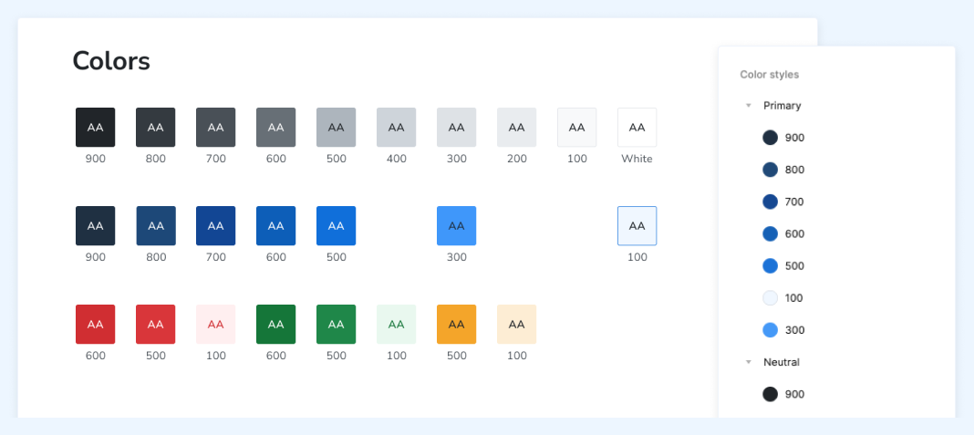
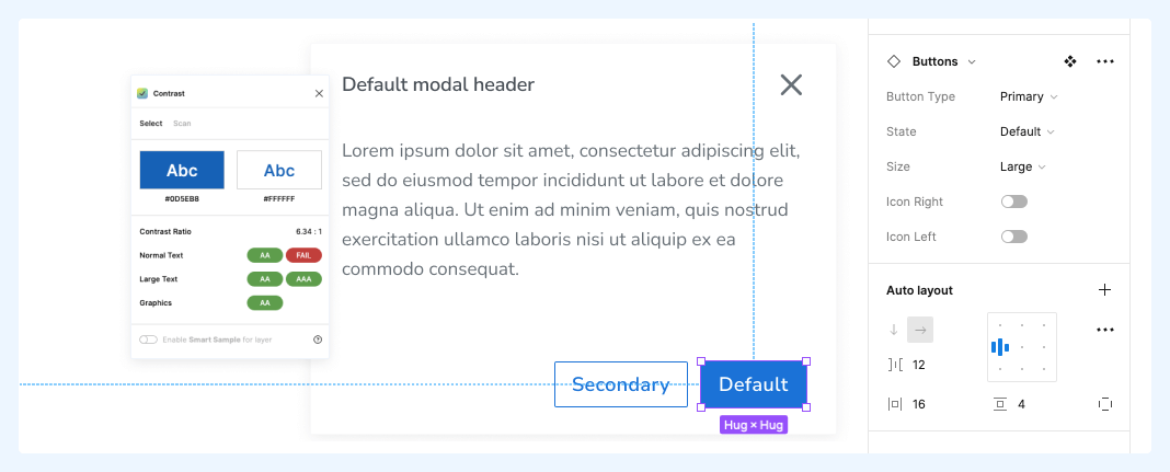
After we worked in a shared ’sketchpad’ space to finalize our color palette and typography, we built them out as defined styles, with fluid, token-friendly naming conventions and WCAG 2.0 / AA compliance as a minimum
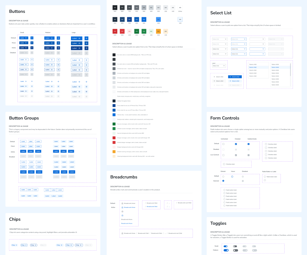
Before moving components to separate pages in the master library, we built everything in one kitchen sink overview page so we could see our designs side by side with the other UI elements they would share the screen with. This helped us keep weight, color, and scale consistent throughout
On top of our already robust library, we knew we would need to support heavy data viz. Existing styles were kept and iterated on to build out cards and components dedicated to helping our users get a clear overview of their analytic needs. These cards could be reusable and tailor fit to our different user types needs and subscriptions
Using simple yet robust component sets with clearly defined variables that passed compliance/accessibility checks made the library easy to use and kept designs consistent. This workflow also allowed us to easily change our designs as needed without breaking the system
03
Our team decided on Zeroheight as the central repository where design and code met. Zeroheight allowed us to sync libraries and document general use, anatomy, and specifications of our UI components
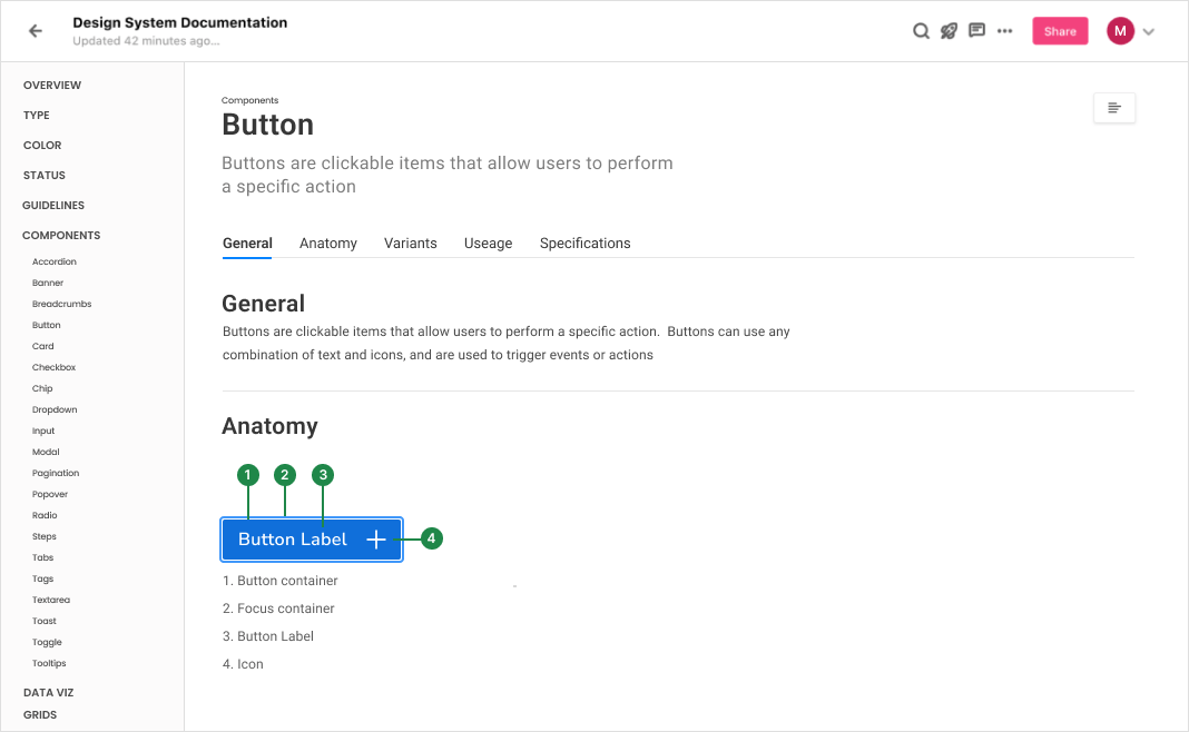
Zeroheight acted as a central hub where design, engineering, and stakeholders could all pull from a central source
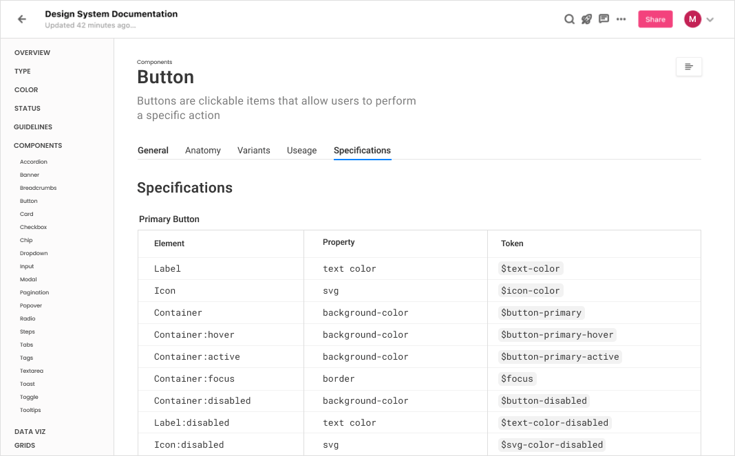
Design tokens were introduced to make sure development and design were speaking the same language while also allowing engineering to keep modular, easily updated design files
04
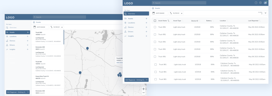
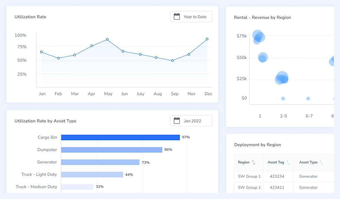
Our works contributed towards both high resolution, design handoff ready screens, high-fidelity prototypes for further testing, and an MVP. The majority of our user base would be spending their time in the ‘Map’ view, looking for specific assets in the field, or common job sites they oversaw
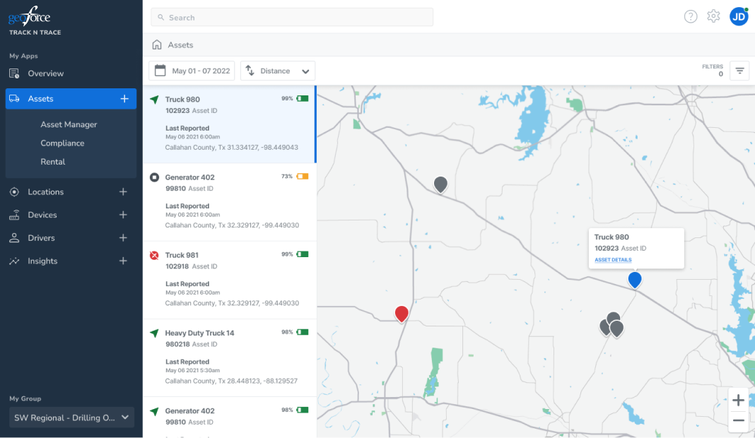
We wanted to keep the map view consistent - only better - with our current platform offering. We heard, read and saw our users when they insisted this was the key view for them. Easily visible assets, their location, and filterable details and dates gave them the bulk of what they needed
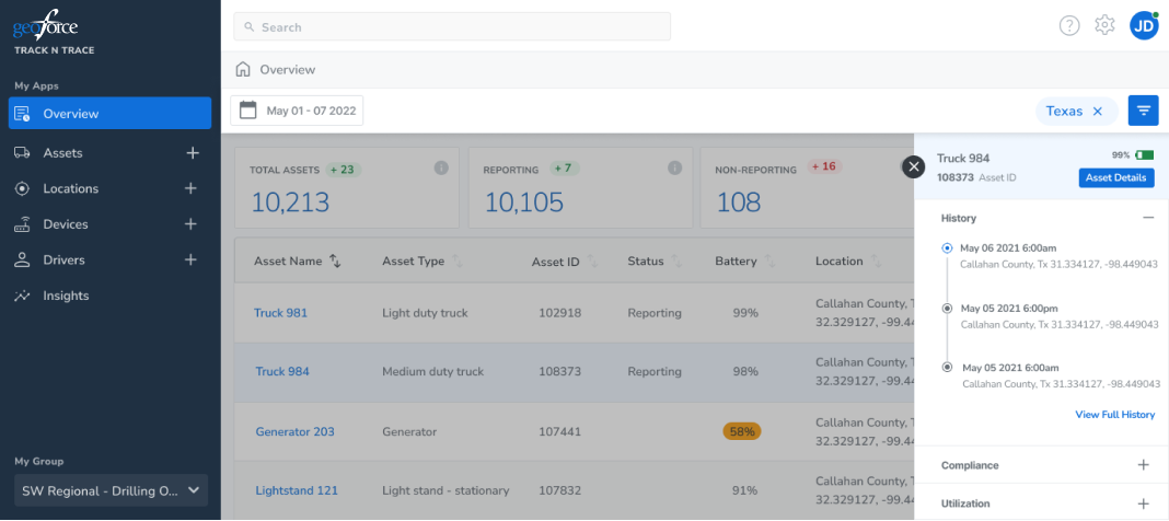
On top of high level KPI customizable cards, the data grid allowed our users to filter and sort thru their assets and pull the data they were looking for at a high level - or gave them a gateway to dig deeper
THE END
I love design systems. For me, they’re a great way of creating and maintaining a beautiful, enjoyable user experience while allowing room to grow as your needs change. Figma makes this so much easier than it was years ago too.
The biggest challenge from a design stand point comes from making sure everyones voices are heard. One of the things that stood out here from the beginning was democratizing the design process internally and building strong rational for why we made the choices we did went a long way in both keeping the UCD team on the same page while keeping engineering & project leadership teams happy.
This also started off in a casual manner, where we all workshopped different ideas and quickly passed/moved forward with design decisions. Staying loose creatively until it was time to start building allowed us to design the best product possible.
While resource and budget restrictions ultimately slowed down our progress, I couldn’t be more proud of the ground our small team covered and the progress we made!
Read more about the process!